内容目录:
- 过渡动画;
- 过渡动画的属性;
一、过渡动画
 过渡(transition)作用:
   - 通过过渡可以指定一个属性发生变化时的切换方式
   - 通过过渡可以创建一些非常好的效果,提升用户的体验
现在我们通过一个小项目来了解这个过渡动画用在哪里,注意这里不借助js,是纯css来实现?
<!DOCTYPE html>
<html lang="en">
  <head>
    <meta charset="UTF-8" />
    <meta http-equiv="X-UA-Compatible" content="IE=edge" />
    <meta name="viewport" content="width=device-width, initial-scale=1.0" />
    <title>Document</title>
    <style>
      * {
        margin: 0;
        padding: 0;
      }
      .box1 {
        width: 500px;
        height: 500px;
        background-color: silver;
        /* 开启bfc,防止重叠 */
        overflow: hidden;
      }

      .box1 div {
        width: 100px;
        height: 100px;
        /* 特别注意,当这里设置margin的时候,因为可能上边距重贴,导致无法正常下移动
      所以必须在box1上,写 overflow: hidden;*/
        margin-bottom: 100px;
      }
      .box2 {
        background-color: green;
      }
    </style>
  </head>
  <body>
    <div class="box1">
      <div class="box2"></div>
    </div>
  </body>
</html>
需求:
当我鼠标移动到box1的时候,我要改变box2的宽高为200.
实现:
/* 根据后代元素选择器: */
  .box1:hover .box2{
    width: 200px;
    height: 200px;
  }
写上后,发现宽高会变大,但是效果是box2突然变大。
优化:
  .box2 {
        background-color: green;
        /* box2的宽高,都在0.3s内过渡中变大 */
        transition: all .3s;
      }
或者
    .box2 {
        background-color: green;
        /* 仅仅只让hegiht 高度属性在0.3s缓慢变大道200px */
        transition: height .3s;

      }
二、过渡动画属性
1.transition-property - 指定要执行的过渡的属性;
- 多个属性间是用,隔开;
- 如果所有属性都需要过度,则使用all关键字,
- 大部分属性都支持过渡效果
 .box2 {
        background-color: green;
         /* 这个表示所有属性都过渡变化
        transition-property:all; */
         /* 这个表示,只是width进行过渡变化
        transition-property: width;
         */

         /* 宽,高,属性都进行过渡变化 */
        transition-property: width, height;


      }
2.transition-duration - 指定过渡效果的时间
需求:比如我想当用户鼠标移动到box1上时,box2 在 2s内缓慢变大(宽高都变),且颜色变成橘色。
   .box2 {
        background-color: green;
        /* 这个表示所有属性都过渡变化*/
        transition-property:all;
        /* 指定过渡效果的时间 ,时间单位s , ms; 1s = 1000ms*/
        transition-duration: 2s;
      }
	或者 - /* 过渡时间还可以这样用 */
   .box2 {
        background-color: green;
        /* 可以针对不同的属性,指定对应的时间 */
        transition-property: height, width;
        transition-duration: 100ms , 2s;
      }


      /* 根据后代元素选择器 :太突然变大 */
      .box1:hover .box2{
        width: 200px;
        height: 200px;
        background-color: orange;
      }
注意:必须是从一个有效数值向另外一个有效数值过渡,不能是auto 去 到另一个数值,就可能设置了过渡效果也会无效。 比如box2 原来width:auto, 现在你设置当hover时, box2:200px, 然后加过渡效果,这就是无效的
比如我想给box2 margin-left 做过渡效果。让一开始从最后margin-left:400px;,往回走到最开始margin-left: 0;。 此时的400和0就都是有效数值,他们就是从400 像 0 过渡。
 .box2 {
        margin-left:400px;
        background-color: green;
        transition-property:all;
        transition-duration: 2s;
      }

      .box1:hover .box2{
        margin-left: 0;
      }
下面是错误的:
浏览器是无法知道怎么从auto 变到0, 这样展示的效果就是一下就移动0了。
   .box2 {
        /* 当我们把这个换成auto, auto就不是有效数值,
        过渡效果就无法实现 */
        margin-left:auto;
        background-color: green;
        transition-property:all;
        transition-duration: 2s;
      }

      .box1:hover .box2{
        margin-left: 0;
      }
3.transition-timing- function - 过渡的时序函数
可选值(具体看下面分析):
ease ---------默认值,慢速开始,先加速,再减速
linear --------匀速
ease-in ------加速运动
ease-out -----减速运动
ease-in-out — 先加速,后减速
cubic-bezier()–贝塞尔曲线来指定时序函数
steps()分步执行过渡效果, 可以把整个效果分成第一步,第二步…
可以设置第二个值, end, 在时间结束时执行过渡(默认值);start, 在时间开始时执行过渡
需求:
过渡动画,比如让box2,box3,的margin-left 从0 过渡到 400, 这个过程是怎么过渡的, 可以匀速,可以加速, 这就需要这个属性来控制。
实现:
- 先来设置一个没有加这个属性的效果,发现box2,box3过渡效果是一样的。
<!DOCTYPE html>
<html lang="en">
  <head>
    <meta charset="UTF-8" />
    <meta http-equiv="X-UA-Compatible" content="IE=edge" />
    <meta name="viewport" content="width=device-width, initial-scale=1.0" />
    <title>Document</title>
    <style>
      * {
        margin: 0;
        padding: 0;
      }
      .box1 {
        width: 500px;
        height: 500px;
        background-color: silver;
        /* 开启bfc,防止重叠 */
        overflow: hidden;
      }

      .box1 div {
        width: 100px;
        height: 100px;
        margin-bottom: 100px;
        margin-left: 0;
      }

      .box2 {

        background-color: green;
        transition-property:all;
        transition-duration: 2s;

      }
      .box3{
        background-color: orange;
        transition-property: all;
        transition-duration: 2s;
      }
      /* 表示box1下的所有元素都移动,即box2,box3 */
      .box1:hover div{
        margin-left: 400px;
      }

    </style>
  </head>
  <body>
    <div class="box1">
      <div class="box2"></div>
      <div class="box3"></div>
    </div>
  </body>
</html>
2.接下来对box2进行加工
   .box2 {

        background-color: green;
        transition-property:all;
        transition-duration: 2s;
         /* 过渡时序
         ease:默认值,慢速开始,先加速,再减速, 这里发现box2和box3 都是一样的匀速运动。效果上没有区别
         */
        transition-timing-function: ease;

      }
试试第换下面的属性值:
  .box2 {

        background-color: green;
        transition-property:all;
        transition-duration: 2s;
         /* 过渡时序
         linear 匀速, 此时对比box2,box3,会发现,box2一直匀速,box3 因为没有单独设置
          transition-timing-function, 他默认就是ease 先加速,在减速,所以很容易
          发现他们出现前后速度不一的运动
         */
        transition-timing-function: linear;

      }
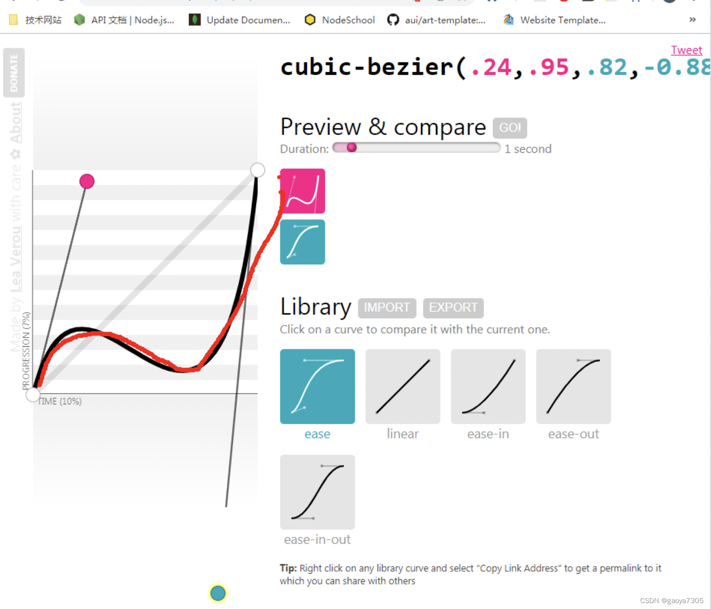
3.通过cubic-bezier()–贝塞尔曲线来指定时序函数
- 我们不用自己设计,直接通过网https://cubic-bezier.com (来设置这个函数里面的值,注意是看左下角,的#后面的数值)

  .box2 {

        background-color: green;
        transition-property:all;
        transition-duration: 2s;
         /* 过渡时序
         如果用贝塞尔曲线表示匀速
         */
        /* transition-timing-function: linear; */
        transition-timing-function:cubic-bezier(0,0,1,1);

      }
这里的(0,0)就是粉红色手柄坐标,(1,1) 是蓝色手柄坐标,通过这两个坐标就可以确定这个贝塞尔曲线。
- 我们可以通过拖动这两个手柄,来自定义贝塞尔曲线,曲线的高低,就是加速和减速。
比如这里的拖动后,我们直接看最顶部的对应的值,复制他。
   .box2 {

        background-color: green;
        transition-property:all;
        transition-duration: 2s;
         /* 过渡时序
         自己设计的贝塞尔曲线
         */

        transition-timing-function:cubic-bezier(.24,.95,.82,-0.88);

      }
- steps()分步执行过渡效果.
前面没有设置这个的时候,都是通过过渡效果,很流畅的margin-left 进行位移。
现在加了这个后,会发现他是根据的数值,分步骤去位移,是停顿式的走,不是流畅的。
   .box2 {

        background-color: green;
        transition-property:all;
        transition-duration: 2s;
         /* 过渡时序
         表示box2 从 margin-left: 0 过渡 到400 在2s内分3步,走到位
         */

        transition-timing-function:steps(3);

      }
- steps()分步执行过渡效果
可以设置一个第二个值:
end, 在时间结束时执行过渡(默认值);
start, 在时间开始时执行过渡 ;
  .box2 {

        background-color: green;
        transition-property:all;
        transition-duration: 2s;
         /* 过渡时序
        steps 其实他里面其实是可以传第二个参数,我们没有写,他其实默认是end.

        比如这里是2步,也就是整个动画分成1s 1s, 然后box2 在每个1s 是他的开始,还是
        结束的时候开始运动,这里是end, 就表示1s结尾,在继续运动,往右走。
         */

        /* transition-timing-function:steps(2,end); */

        /* 如果我们改成start, 就表示每个的1s 开始就动画,你会发现运行后,里面就开始运动 */
        transition-timing-function:steps(2,start);
      }
- transition-delay 延迟效果
 .box2 {

        background-color: green;
        transition-property:all;
        transition-duration: 2s;
        /* 过渡效果的延迟,等待相应的时间后再执行 */
        transition-delay:2s;
      }
6.上面这么多属性,transition 可以同时设置过渡相关所有属性。
只有一个要求,如果要写延迟,则两个事件中第一个是持续时间,第二个是延迟时间。其他的没有顺序
 .box2 {

        background-color: green;
        /* transition-property:all;
        transition-duration: 2s;
        transition-delay:1s; */

        /*
        一次性就设置完成
       */
        transition:2s margin-left 1s cubic-bezier(.25,.1,.25,1);
      }