边框一
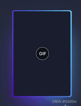
.leftClass {
    background: #000;
    /* -webkit-animation: twinkling 1s infinite ease-in-out; 1秒钟的开始结束都慢的无限次动画 */
}
.leftClass::before {
  content: "";
  width: 104%;
  height: 102%;
  border-radius: 8px;
  background-image: linear-gradient(
    var(--rotate)
    , #1e2ce7, #0a0f90 43%, #03035a);
  position: absolute;
  z-index: -1;
  top: -1%;
  left: -2%;
  animation: spin 2.5s linear infinite;
}
.leftClass::after {
    position: absolute;
  content: "";
  top: calc(var(--card-height) / 6);
  left: 0;
  right: 0;
  z-index: -1;
  height: 100%;
  width: 100%;
  margin: 0 auto;
  transform: scale(0.8);
  filter: blur(calc(var(--card-height) / 6));
  background-image: linear-gradient(
    var(--rotate)
    ,#1e2ce7, #0a0f90 43%, #03035a);
    opacity: 1;
  transition: opacity .5s;
  animation: spin 2.5s linear infinite;
}
.leftClass:hover {
  color: rgb(88 199 250 / 100%);
  transition: color 1s;
}
.leftClass:hover:before, .leftClass:hover:after {
  animation: none;
  opacity: 0;
}
边框二


```cpp
.leftClass {
    width: 32%;
    height: auto;
     -webkit-animation: twinkling 1s infinite ease-in-out;
}
@-webkit-keyframes twinkling{
                0% {
                    border-color: #240eea;
                    box-shadow: 0 0 10px rgba(29, 84, 237, 0.2), inset 0 0 10px rgba(13, 63, 201, 0.1), 0 1px 0 rgb(51, 68, 153);
                }
                100% {
                    border-color: rgb(44, 15, 206);
                    box-shadow: 0 0 25px rgba(29, 84, 237,.6), inset 0 0 15px rgba(13, 63, 201, 0.4), 0 1px 0 rgb(36, 21, 174);
                }
            }
边框三
div {
    position: relative;
    border: 1px solid #03A9F3;

    &::before,
    &::after {
        content: "";
        position: absolute;
        width: 20px;
        height: 20px;
    }

    &::before {
        top: -5px;
        left: -5px;
        border-top: 1px solid var(--borderColor);
        border-left: 1px solid var(--borderColor);
    }

    &::after {
        right: -5px;
        bottom: -5px;
        border-bottom: 1px solid var(--borderColor);
        border-right: 1px solid var(--borderColor);
    }

    &:hover::before,
    &:hover::after {
        width: calc(100% + 9px);
        height: calc(100% + 9px);
    }
}
边框四
.leftClass {
    width:300px;
    height: 500px;
  border: 2px solid #00a1ff;
  border-radius: 8px;
  box-shadow: rgba(0, 253, 219, 0.5) 0px 0px 20px inset;
    background: linear-gradient(to left, #00fd15, #00fd15) left top no-repeat,
    linear-gradient(to bottom, #00fd15, #00fd15) left top no-repeat,
    linear-gradient(to left, #00fd15, #00fd15) right top no-repeat,
    linear-gradient(to bottom, #00fd15, #00fd15) right top no-repeat,
    linear-gradient(to left, #00fd15, #00fd15) left bottom no-repeat,
    linear-gradient(to bottom, #00fd15, #00fd15) left bottom no-repeat,
    linear-gradient(to left, #00fd15, #00fd15) right bottom no-repeat,
    linear-gradient(to left, #00fd15, #00fd15) right bottom no-repeat;
    background-size: 0.5px 10px, 10px 1px, 1px 10px, 10px 1px;
}
.leftClass::before {
  position: absolute;
  content: "";
  top: -2px;
  bottom: -2px;
  left: 30px;
  width: calc(100% - 60px);
  border-top: 2px solid #016886;
  border-bottom: 2px solid #016886;
  z-index: 0;
}
.leftClass::after {
  position: absolute;
  content: "";
  top: 30px;
  right: -2px;
  left: -2px;
  height: calc(100% - 60px);
  border-right: 2px solid #016886;
  border-left: 2px solid #016886;
  z-index: 0;
}
边框五 流星(边框看着是动起来的)
<div>
	   <i class="top"></i><i class="bottom"></i>
</div>
.leftClass {
    width: 32%;
    height: auto;
    border: 1px solid #121f71;
    overflow: hidden;


    i {
      position: absolute;
      display: inline-block;
      height: 4px;
      width: 100%;
    }
    .bottom {
      bottom: 0;
      left: -100%;
      background-image: linear-gradient(
        270deg,
        transparent,
        #74efff,
        transparent
      );
      animation: one 4s linear 1s infinite;
    }
    .top {
      top: 0;
      right: -100%;
      background-image: linear-gradient(
        270deg,
        transparent,
        #74efff,
        transparent
      );
      animation: three 4s linear 3s infinite;
    }
}
.leftClass::before {
      content: ' ';
      position: absolute;
      width: 4px;
      height: 100%;
      top: -100%;
      left: 0;
      background-image: linear-gradient(
        0deg,
        transparent,
        #74efff,
        transparent
      );
      animation: two 4s linear infinite;
    }
    .leftClass::after {
      content: ' ';
      position: absolute;
      width: 4px;
      height: 100%;
      bottom: -100%;
      right: 0;
      background-image: linear-gradient(
        360deg,
        transparent,
        #74efff,
        transparent
      );
      animation: four 4s linear 2s infinite;
    }

    @keyframes one {
  0% {
    left: -100%;
  }
  50%,
  100% {
    left: 100%;
  }
}

@keyframes two {
  0% {
    top: -100%;
  }
  50%,
  100% {
    top: 100%;
  }
}

@keyframes three {
  0% {
    right: -100%;
  }
  50%,
  100% {
    right: 100%;
  }
}

@keyframes four {
  0% {
    bottom: -100%;
  }
  50%,
  100% {
    bottom: 100%;
  }
}
其他好看的
https://www.php.cn/faq/484335.html