目录
一、线性布局(Row、Column)
二、层叠布局(StackLayout)
三、弹性布局(Flex)
3.1 布局方向
3.2 布局换行
3.3 主轴对齐方式
3.4 交叉轴对齐方式
3.4.1 容器组件设置交叉轴对齐
3.4.2 子组件设置交叉轴对齐
3.4.3 内容对齐
3.5 自适应拉伸
四、相对布局(RelativeContainer)
五、列表(List)
5.1 ListItem
5.2 迭代列表内容
5.3 ListItemGroup
5.4 粘性标题效果(吸顶)
5.5 侧滑
5.6 下拉刷新与上拉加载
六、网格布局(Grid)
6.1 设置行列数量与占比
6.2 设置子组件所占行列数
6.3 可滚动的网格布局
6.4 拖拽
七、轮播(Swiper)
7.1 基本使用
7.2 页面切换
相关推荐
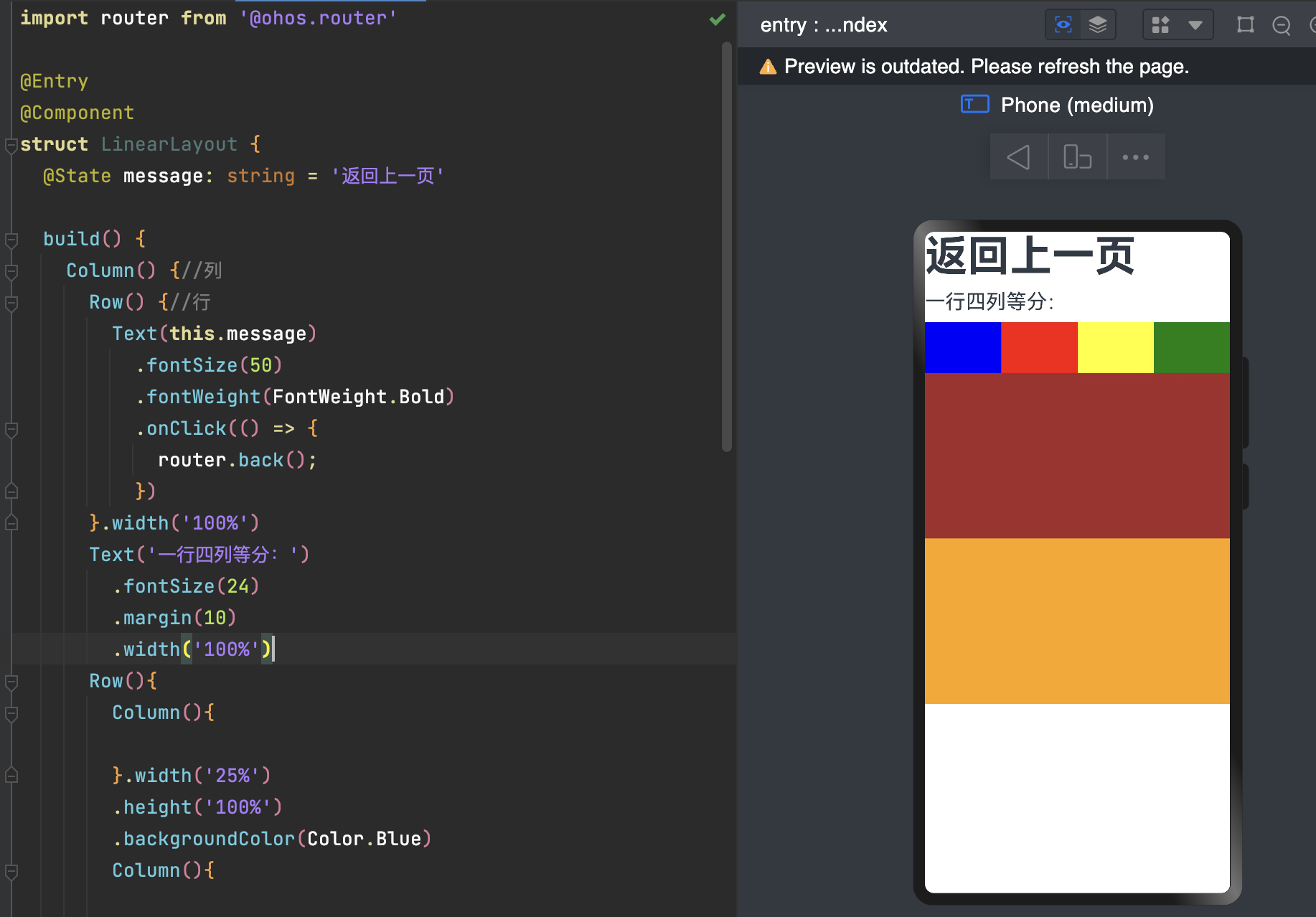
一、线性布局(Row、Column)
如果布局内子元素为复数个,且能够以某种方式线性排列时优先考虑此布局。
  build() {
    Column() {//列
      Row() {//行
        Text(this.message)
          .fontSize(50)
          .fontWeight(FontWeight.Bold)
          .onClick(() => {
            router.back();
          })
      }.width('100%')
      Text('一行四列等分:')
        .fontSize(24)
        .margin(10)
        .width('100%')
      Row(){
        Text('好').width('25%').height('100%')
          .backgroundColor(Color.Blue)
        Text('好').width('25%').height('100%')
          .backgroundColor(Color.Red)
        Text('学').width('25%').height('100%')
          .backgroundColor(Color.Yellow)
        Text('习').width('25%').height('100%')
          .backgroundColor(Color.Green)
      }
      .height(60)
      Row() {//行

      }.width('100%')
      .height('25%')
      .backgroundColor(Color.Brown)
      Row() {//行

      }.width('100%')
      .height('25%')
      .backgroundColor(Color.Orange)
    }
  }
二、层叠布局(StackLayout)
用于在屏幕上预留一块区域来显示组件中的元素,提供元素可以重叠的布局。层叠布局通过Stack容器组件实现位置的固定定位与层叠,容器中的子元素(子组件)依次入栈,后一个子元素覆盖前一个子元素,子元素可以叠加,也可以设置位置。
层叠布局具有较强的页面层叠、位置定位能力,其使用场景有广告、卡片层叠效果等。
      Stack(){
        Column(){}.width('80%').height('80%')
        .backgroundColor(Color.Blue)
        Column(){}.width('60%').height('60%')
        .backgroundColor(Color.Green)
        Column(){}.width('30%').height('30%')
        .backgroundColor(Color.Pink)
      }.height('50%')
      .width('100%').backgroundColor(Color.Orange)

对齐方式
Stack(){}.alignContent(Alignment.TopEnd)

interface StackInterface {
    (value?: {
        alignContent?: Alignment;
    }): StackAttribute;
}
declare class StackAttribute extends CommonMethod<StackAttribute> {
    alignContent(value: Alignment): StackAttribute;
}

declare enum Alignment {
    TopStart, //顶部左对齐
    Top,//顶部水平居中
    TopEnd,//顶部右对齐
    Start, //垂直居中左对齐
    Center,  //居中对齐
    End,  //垂直居中右对齐
    BottomStart, //底部左对齐
    Bottom,   //底部水平居中
    BottomEnd  //底部右对齐
}
默认 居中对齐,当前设置 alignContent(Alignment.TopEnd) 的是顶部右对齐。

三、弹性布局(Flex)
弹性布局是与线性布局类似的布局方式。区别在于弹性布局默认能够使子组件压缩或拉伸。在子组件需要计算拉伸或压缩比例时优先使用此布局,可使得多个容器内子组件能有更好的视觉上的填充容器效果。
-
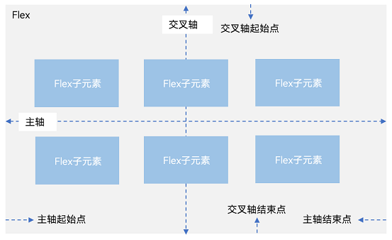
主轴:Flex组件布局方向的轴线,子元素默认沿着主轴排列。主轴开始的位置称为主轴起始点,结束位置称为主轴结束点。
-
交叉轴:垂直于主轴方向的轴线。交叉轴开始的位置称为交叉轴起始点,结束位置称为交叉轴结束点。
例如 主轴 是横向布局,那么交叉轴就是垂直,例如交叉轴对齐就是垂直对齐。
Flex(){
        Text('2024').fontSize(20).width('80%').height(100)
          .backgroundColor(Color.Blue)
        Text('03').fontSize(20).width('60%').height(100)
          .backgroundColor(Color.Green)
        Text('11').fontSize(20).width('30%').height(100)
          .backgroundColor(Color.Pink)
      }.width('100%')

这里可以看出 width = 80% + 60% +30% 已经超出 100% 了 依然显示,明显进行了压缩。
declare interface FlexOptions {
    /**
    * 子组件在Flex容器上排列的方向,即主轴的方向。
    * 默认值:FlexDirection.Row
    */
    direction?: FlexDirection;
    /**
    * Flex容器是单行/列还是多行/列排列。
    * 说明:在多行布局时,通过交叉轴方向,确认新行堆叠方向。
    * 默认:FlexWrap.NoWrap(子组件单行布局)
    */
    wrap?: FlexWrap;
    /**
     * 所有子组件在Flex容器主轴上的对齐格式。
     * 默认值:FlexAlign.Start
     */
    justifyContent?: FlexAlign;
    /**
     * 所有子组件在Flex容器交叉轴上的对齐格式。
     * 默认值:ItemAlign.Start
     */
    alignItems?: ItemAlign;
    /**
     * 交叉轴中有额外的空间时,多行内容的对齐方式。仅在wrap为Wrap或WrapReverse下生效。
     * 默认值FlexAlign.Start
     */
    alignContent?: FlexAlign;
}
interface FlexInterface {
    (value?: FlexOptions): FlexAttribute;
}
declare class FlexAttribute extends CommonMethod<FlexAttribute> {
}
declare const Flex: FlexInterface;
declare const FlexInstance: FlexAttribute;
3.1 布局方向
通过设置参数direction,决定主轴的方向,从而控制子组件的排列方向。

-
FlexDirection.Row(默认值):主轴为水平方向,子组件从起始端沿着水平方向开始排布。
-
FlexDirection.RowReverse:主轴为水平方向,子组件从终点端沿着FlexDirection. Row相反的方向开始排布。
-
FlexDirection.Column:主轴为垂直方向,子组件从起始端沿着垂直方向开始排布。
-
FlexDirection.ColumnReverse:主轴为垂直方向,子组件从终点端沿着FlexDirection. Column相反的方向开始排布。
FlexDirection.RowReverse 如下:

      Flex({direction:FlexDirection.RowReverse}){
        Text('2024').fontSize(20).width('80%').height(100)
          .backgroundColor(Color.Blue)
        Text('03').fontSize(20).width('60%').height(100)
          .backgroundColor(Color.Green)
        Text('11').fontSize(20).width('30%').height(100)
          .backgroundColor(Color.Pink)
      }.width('100%').margin({ top:10 })
3.2 布局换行
通过设置参数wrap,决定弹性布局单行布局还是多行布局。
-
FlexWrap. NoWrap(默认值):单行布局,不换行。如果子组件的宽度总和大于父元素的宽度,则子组件会被压缩宽度。
-
FlexWrap. Wrap:多行布局,换行,每一行子组件按照主轴方向排列。
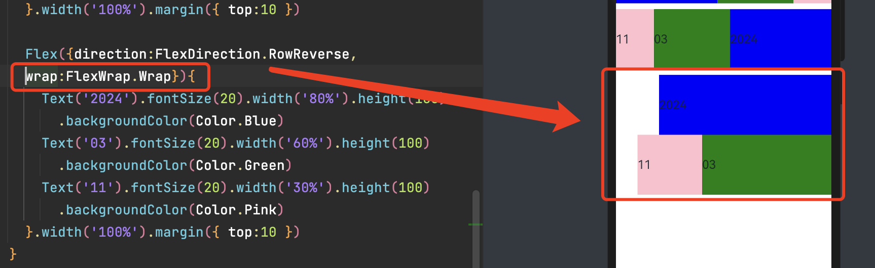
      Flex({
        direction:FlexDirection.RowReverse,
        wrap:FlexWrap.Wrap}){
        Text('2024').fontSize(20).width('80%').height(100)
          .backgroundColor(Color.Blue)
        Text('03').fontSize(20).width('60%').height(100)
          .backgroundColor(Color.Green)
        Text('11').fontSize(20).width('30%').height(100)
          .backgroundColor(Color.Pink)
      }.width('100%').margin({ top:10 })
3.3 主轴对齐方式
通过设置参数justifyContent,决定主轴方向的对齐方式。
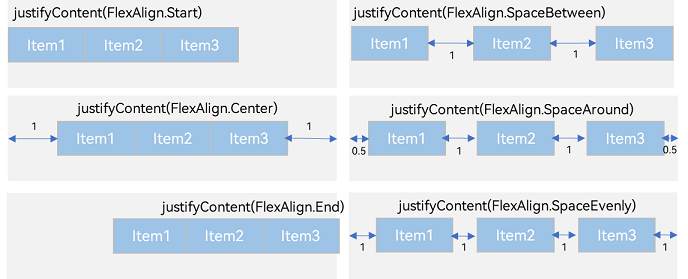
官方图
-
FlexAlign.Start(默认值):子组件在主轴方向起始端对齐, 第一个子组件与父元素边沿对齐,其他元素与前一个元素对齐。
-
FlexAlign.Center:子组件在主轴方向居中对齐。
-
FlexAlign.End:子组件在主轴方向终点端对齐, 最后一个子组件与父元素边沿对齐,其他元素与后一个元素对齐。
-
FlexAlign.SpaceBetween:Flex主轴方向均匀分配弹性元素,相邻子组件之间距离相同。第一个子组件和最后一个子组件与父元素边沿对齐。
-
FlexAlign.SpaceAround:Flex主轴方向均匀分配弹性元素,相邻子组件之间距离相同。前/后留有 边距(组件间距/2)
-
FlexAlign.SpaceEvenly:Flex主轴方向元素等间距布局,相邻子组件之间的间距、前/后留有边距都相同。
      Flex({ justifyContent:FlexAlign.SpaceAround }){
        Text('2024').fontSize(20).width('25%').height(100)
          .backgroundColor(Color.Blue)
        Text('03').fontSize(20).width('25%').height(100)
          .backgroundColor(Color.Green)
        Text('11').fontSize(20).width('25%').height(100)
          .backgroundColor(Color.Pink)
      }.width('100%').margin({ top:10 })
3.4 交叉轴对齐方式
容器和子元素都可以设置交叉轴对齐方式,且子元素设置的对齐方式优先级较高。
3.4.1 容器组件设置交叉轴对齐
可以通过Flex组件的alignItems参数设置子组件在交叉轴的对齐方式。
-
ItemAlign.Auto(默认):默认对齐。
-
ItemAlign.Start:交叉轴方向首部对齐。
-
ItemAlign.Center:交叉轴方向居中对齐。
-
ItemAlign.End:交叉轴方向底部对齐。
-
ItemAlign.Stretch:交叉轴方向拉伸填充,在未设置尺寸时,拉伸到容器尺寸。
-
ItemAlign. Baseline:交叉轴方向文本基线对齐。

      Flex({alignItems:ItemAlign.Center}){
        Text('2024').fontSize(20).width('25%').height(35)
          .backgroundColor(Color.Blue)
        Text('03').fontSize(20).width('25%').height(70)
          .backgroundColor(Color.Green)
        Text('11').fontSize(20).width('25%').height(100)
          .backgroundColor(Color.Pink)
      }.width('100%').margin({ top:10 })
3.4.2 子组件设置交叉轴对齐
可以通过子组件的alignSelf属性设置子组件在父容器交叉轴的对齐格式,且会覆盖Flex布局容器中alignItems配置。毕竟子元素设置的对齐方式优先级较高。
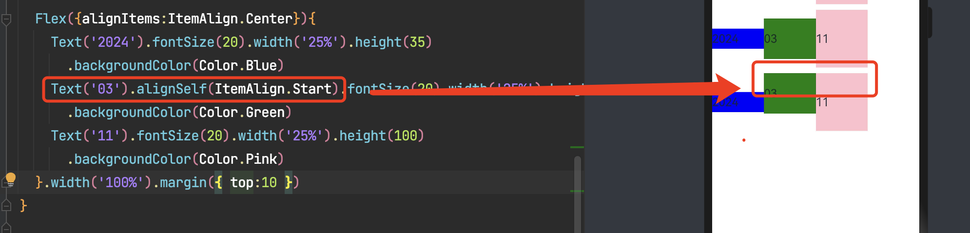
子组件的alignSelf属性已覆盖Flex组件的alignItems配置。
      Flex({alignItems:ItemAlign.Center}){
        Text('2024').fontSize(20).width('25%').height(35)
          .backgroundColor(Color.Blue)
        Text('03').alignSelf(ItemAlign.Start).fontSize(20).width('25%').height(70)
          .backgroundColor(Color.Green)
        Text('11').fontSize(20).width('25%').height(100)
          .backgroundColor(Color.Pink)
      }.width('100%').margin({ top:10 })
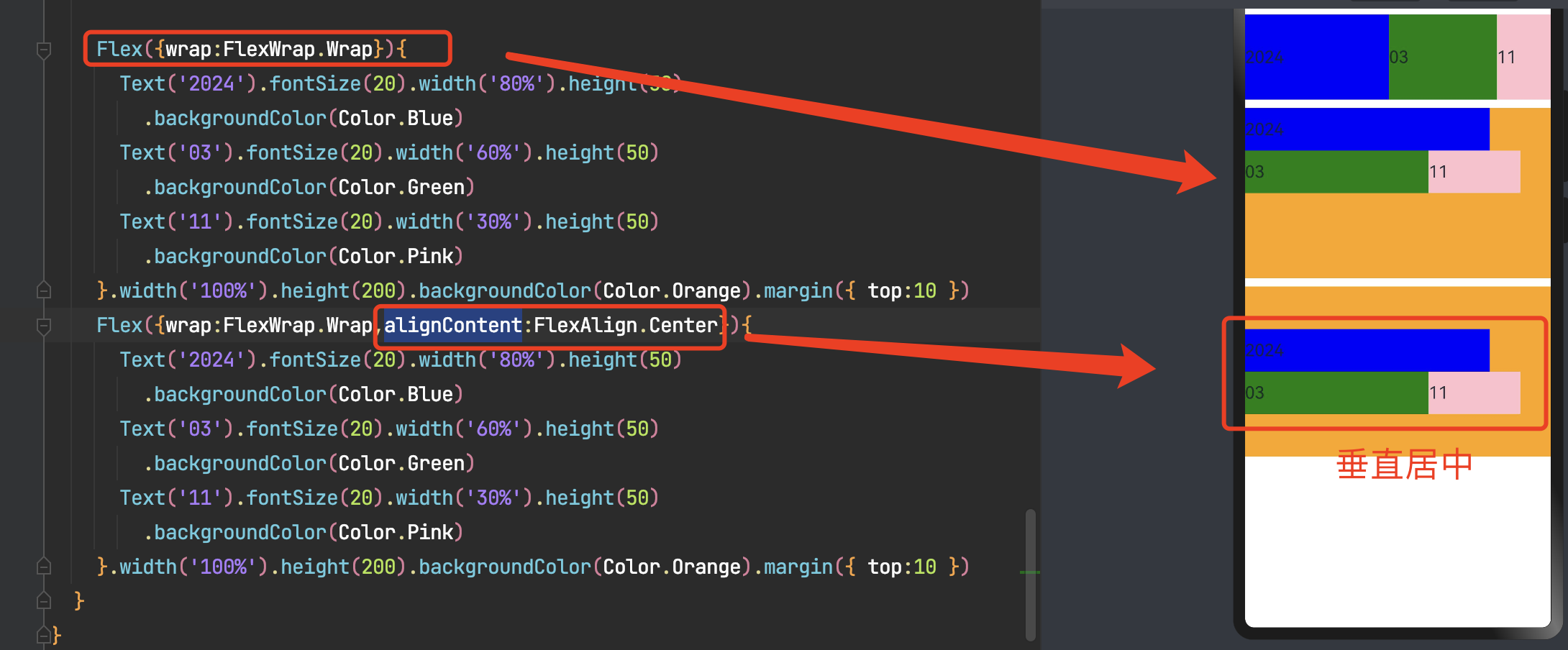
3.4.3 内容对齐
可以通过Flex组件的alignContent参数设置子组件各行在交叉轴剩余空间内的对齐方式,只在多行的flex布局中生效。
-
FlexAlign.Start:子组件各行与交叉轴起点对齐。
-
FlexAlign.Center:子组件各行在交叉轴方向居中对齐。
-
FlexAlign.End:子组件各行与交叉轴终点对齐。
-
FlexAlign.SpaceBetween:子组件各行与交叉轴两端对齐,各行间垂直间距平均分布。
-
FlexAlign.SpaceAround:子组件各行间距相等,是元素首尾行与交叉轴两端距离的两倍。
-
FlexAlign.SpaceEvenly: 子组件各行间距,子组件首尾行与交叉轴两端距离都相等。
  build() {
    Column() {
      Flex({wrap:FlexWrap.Wrap}){
        Text('2024').fontSize(20).width('80%').height(50)
          .backgroundColor(Color.Blue)
        Text('03').fontSize(20).width('60%').height(50)
          .backgroundColor(Color.Green)
        Text('11').fontSize(20).width('30%').height(50)
          .backgroundColor(Color.Pink)
      }.width('100%').height(200).backgroundColor(Color.Orange).margin({ top:10 })
      Flex({wrap:FlexWrap.Wrap,alignContent:FlexAlign.Center}){
        Text('2024').fontSize(20).width('80%').height(50)
          .backgroundColor(Color.Blue)
        Text('03').fontSize(20).width('60%').height(50)
          .backgroundColor(Color.Green)
        Text('11').fontSize(20).width('30%').height(50)
          .backgroundColor(Color.Pink)
      }.width('100%').height(200).backgroundColor(Color.Orange).margin({ top:10 })
3.5 自适应拉伸
在弹性布局父组件尺寸不够大的时候,通过子组件的下面几个属性设置其在父容器的占比,达到自适应布局能力。
-
flexBasis:设置子组件在父容器主轴方向上的基准尺寸。如果设置了该值,则子项占用的空间为设置的值;如果没设置该属性,那子项的空间为width/height的值。
-
flexGrow:设置父容器的剩余空间分配给此属性所在组件的比例。用于“瓜分”父组件的剩余空间。
-
flexShrink: 当父容器空间不足时,子组件的压缩比例。
declare class CommonMethod<T> {
  flexGrow(value: number): T;
  flexShrink(value: number): T;
  flexBasis(value: number | string): T;
}

      //flexBasis
      Flex({}){
        Text('flexBasis-auto')
          .flexBasis("auto")//flexBasis值为auto,未设置width,内容自身宽度
          .fontSize(20).height(100).backgroundColor(Color.Yellow)
        Text('150')
          .flexBasis("auto").width(110)//flexBasis值为auto,设置width值为110,宽度为110vp
          .fontSize(20).height(100).backgroundColor(Color.Green)
        Text('100')
          .flexBasis(100).width(300)//flexBasis值为100,覆盖width的值(不管设置还是未设置),宽度为100vp
          .fontSize(20).height(100).backgroundColor(Color.Pink)
      }.width('100%').margin({ top:10 })

      //flexGrow  分配的是剩余空间
      Flex({}){
        Text('flexGrow-3')
          .flexGrow(3).width(60)//占 Flex 剩余空间 3份
          .fontSize(20).height(100).backgroundColor(Color.Yellow)
        Text('2')
          .flexGrow(2).width(60)//占 Flex 剩余空间 2份
          .fontSize(20).height(100).backgroundColor(Color.Green)
        Text('0')
          .width(60)//无flexGrow,指定width的值
          .fontSize(20).height(100).backgroundColor(Color.Pink)
      }.width('100%').margin({ top:10 })

      //flexShrink
      Flex({}){
        Text('2')
          .flexShrink(2).width('70%')//压缩比例 2
          .fontSize(20).height(100).backgroundColor(Color.Yellow)
        Text('flexShrink-0')
          .width('70%')//无压缩比
          .fontSize(20).height(100).backgroundColor(Color.Green)
        Text('1')
          .flexShrink(2).width('70%')//压缩比例 1
          .fontSize(20).height(100).backgroundColor(Color.Pink)
      }.width('100%').margin({ top:10 })
Visual Pixel: VP是一种基于屏幕尺寸的抽象单位,在不同的设备上具有相同的视觉效果。VP的概念更接近于传统的像素概念在鸿蒙开发中,我们通常使用vp来定义字体大小和图标尺寸。
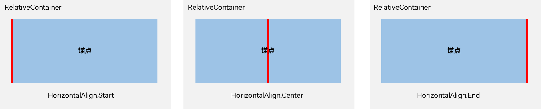
四、相对布局(RelativeContainer)
每个子组件位置是相对的,可以将父容器作为瞄点,也可以将同一父容器下其他组件作为瞄点。
-
锚点:通过锚点设置当前元素基于哪个元素确定位置。
-
对齐方式:通过对齐方式,设置当前元素是基于锚点的上中下对齐,还是基于锚点的左中右对齐。
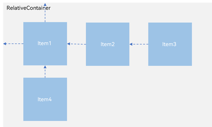
相对布局示意图
子元素并不完全是上图中的依赖关系。比如,Item4可以以Item2/Item3为依赖锚点,也可以以RelativeContainer父容器为依赖锚点。
规则说明
- a.容器内子组件区分水平方向,垂直方向:
-
a.1 水平方向为left, middle, right,对应容器的HorizontalAlign.Start, HorizontalAlign.Center, HorizontalAlign.End。
-
-
a.2 垂直方向为top, center, bottom,对应容器的VerticalAlign.Top, VerticalAlign.Center, VerticalAlign.Bottom。

垂直
- b.子组件可以将容器或者其他子组件设为锚点:
-
b.1 参与相对布局的容器内组件必须设置id,不设置id的组件不显示,容器id固定为__container__。
-
b.2 此子组件某一方向上的三个位置(水平方向为参考a.1,垂直方向为参考a.2)可以指定容器或其他子组件同方向的三个位置(水平方向为参考a.1,垂直方向为参考a.2)为锚点。若同方向上设置两个以上锚点,水平方向Start和Center优先,垂直方向Top和Center优先。例如,水平方向上指定了left以容器的HorizontalAlign.Start为锚点,middle以容器的HorizontalAlign.Center为锚点,又指定right的锚点为容器的HorizontalAlign.End,当组件的width和容器的width不能同时满足3条约束规则时,优先取Start和Center的约束规则。
-
b.3 前端页面设置的子组件尺寸大小不会受到相对布局规则的影响。子组件某个方向上设置两个或以上alignRules时不建议设置此方向尺寸大小。
-
b.4 对齐后需要额外偏移可设置offset。
-
- c.特殊情况
-
c.1 互相依赖,环形依赖时容器内子组件全部不绘制。
-
c.2 同方向上两个以上位置设置锚点但锚点位置逆序时此子组件大小为0,即不绘制。
-
c.3 容器不设置宽高时,容器与容器内子组件不绘制。
-
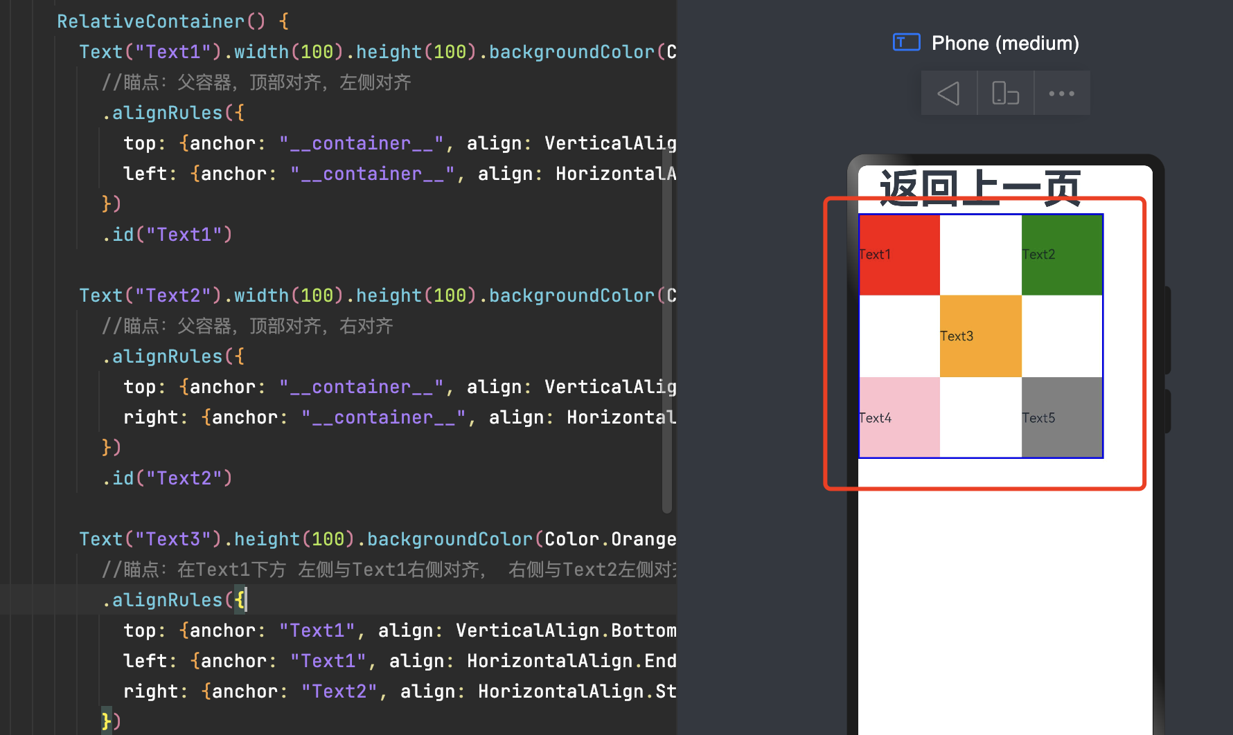
      RelativeContainer() {
        Text("Text1").width(100).height(100).backgroundColor(Color.Red)
          //瞄点:父容器,顶部对齐,左侧对齐
          .alignRules({
            top: {anchor: "__container__", align: VerticalAlign.Top},
            left: {anchor: "__container__", align: HorizontalAlign.Start}
          })
          .id("Text1")

        Text("Text2").width(100).height(100).backgroundColor(Color.Green)
          //瞄点:父容器,顶部对齐,右对齐
          .alignRules({
            top: {anchor: "__container__", align: VerticalAlign.Top},
            right: {anchor: "__container__", align: HorizontalAlign.End}
          })
          .id("Text2")

        Text("Text3").height(100).backgroundColor(Color.Orange)
          //瞄点:在Text1下方 左侧与Text1右侧对齐, 右侧与Text2左侧对齐。
          .alignRules({
            top: {anchor: "Text1", align: VerticalAlign.Bottom},
            left: {anchor: "Text1", align: HorizontalAlign.End},
            right: {anchor: "Text2", align: HorizontalAlign.Start}
          })
          .id("Text3")
        Text("Text4").height(100).backgroundColor(Color.Pink)
          //瞄点:在Text3下方 左侧与父容器对齐, 右侧和Text3左边对齐
          .alignRules({
            top: {anchor: "Text3", align: VerticalAlign.Bottom},
            left: {anchor: "__container__", align: HorizontalAlign.Start},
            right: {anchor: "Text3", align: HorizontalAlign.Start}
          })
          .id("Text4")
        Text("Text5").height(100).backgroundColor(Color.Gray)
          //瞄点:在Text3下方 右侧与父容器对齐, 右侧和Text3左边对齐
          .alignRules({
            top: {anchor: "Text3", align: VerticalAlign.Bottom},
            right: {anchor: "__container__", align: HorizontalAlign.End},
            left: {anchor: "Text3", align: HorizontalAlign.End}
          })
          .id("Text5")
      }
      .width(300).height(300)
      .border({ width: 2, color: Color.Blue })
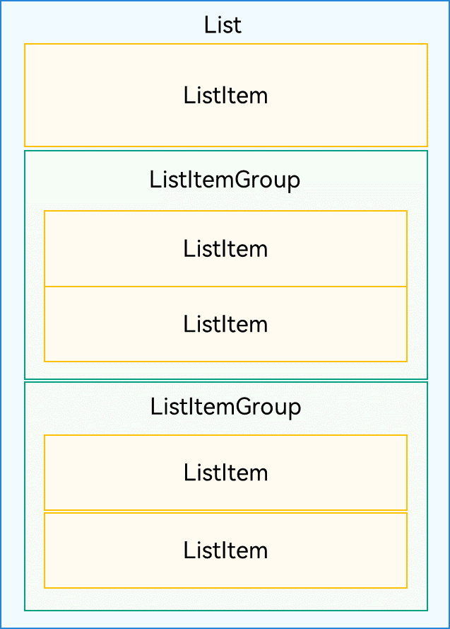
五、列表(List)
使用列表可以轻松高效地显示结构化、可滚动的信息。在ArkUI中,列表具有垂直和水平布局能力和自适应交叉轴方向上排列个数的布局能力,超出屏幕时可以滚动。
List的子组件必须是ListItemGroup或ListItem,ListItem和ListItemGroup必须配合List来使用。
5.1 ListItem
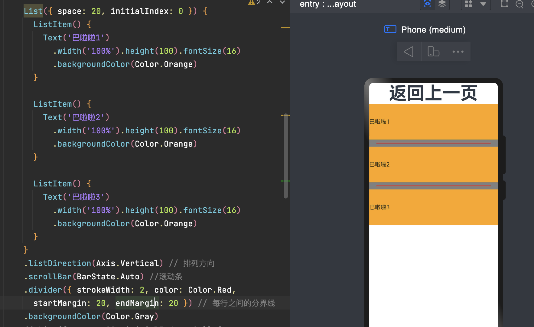
      List({ space: 20, initialIndex: 0 }) {
        ListItem() {
          Text('巴啦啦1')
            .width('100%').height(100).fontSize(16)
            .backgroundColor(Color.Orange)
        }

        ListItem() {
          Text('巴啦啦2')
            .width('100%').height(100).fontSize(16)
            .backgroundColor(Color.Orange)
        }

        ListItem() {
          Text('巴啦啦3')
            .width('100%').height(100).fontSize(16)
            .backgroundColor(Color.Orange)
        }
      }
      .listDirection(Axis.Vertical) // 排列方向
      .scrollBar(BarState.Auto) //滚动条
      .divider({ strokeWidth: 2, color: Color.Red,
        startMargin: 20, endMargin: 20 }) // 每行之间的分界线
      .backgroundColor(Color.Gray)
如果数据少我们可以这样写,如果数据多,我们这样写就比较蠢啦,需要借助迭代来解决。
5.2 迭代列表内容
应用通过数据集合动态地创建列表。使用循环渲染可从数据源中迭代获取数据,并在每次迭代过程中创建相应的组件,降低代码复杂度。

struct ListLayout {
  @State message: string = '返回上一页'
  private arr: number[] = [0, 1, 2, 3, 4, 5, 6, 7, 8, 9]
  build() {
    Column() {
      List({ space: 20, initialIndex: 0 }) {
        //循环添加
        ForEach(this.arr, (item) => {
          ListItem() {
            Text('巴啦啦' + item)
              .width('100%').height(100).fontSize(16)
              .textAlign(TextAlign.Center).borderRadius(10)
              .backgroundColor(Color.Orange)
          }
        }, item => item)
      }
      .listDirection(Axis.Vertical) // 排列方向
      .scrollBar(BarState.Auto)//滚动条
      .divider({ strokeWidth: 2, color: Color.Red,
        startMargin: 20, endMargin: 20 }) // 每行之间的分界线
      .width('100%')
      .height('100%')
      .backgroundColor(Color.Gray)
      .padding({ top: 5 , left:10,right :10 })
    }.height('100%')
  }
}
5.3 ListItemGroup
在列表中支持数据的分组展示,可以使列表显示结构清晰,查找方便,从而提高使用效率。分组列表在实际应用中十分常见,如手机联系人列表。
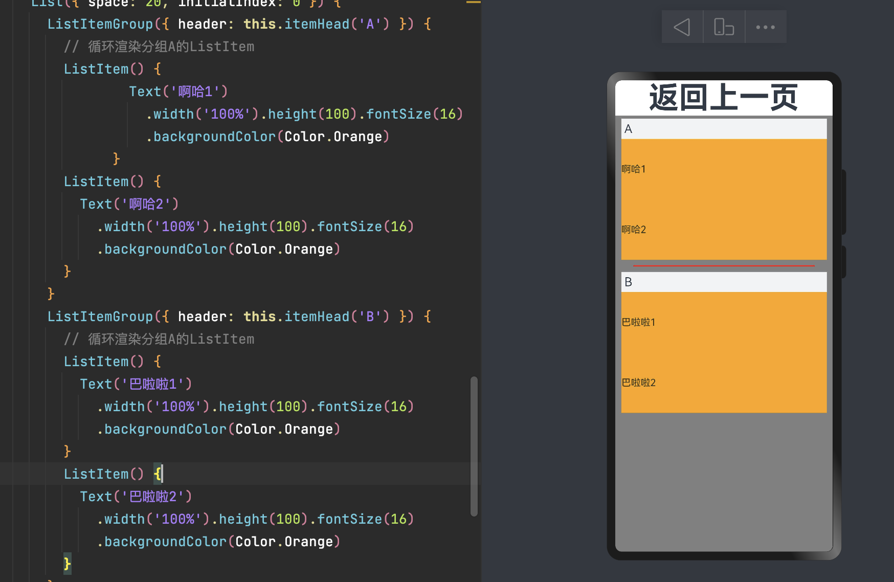
      List({ space: 20, initialIndex: 0 }) {
        ListItemGroup({ header: this.itemHead('A') }) {
          // 循环渲染分组A的ListItem
          ListItem() {
                  Text('啊哈1')
                    .width('100%').height(100).fontSize(16)
                    .backgroundColor(Color.Orange)
                }
          ListItem() {
            Text('啊哈2')
              .width('100%').height(100).fontSize(16)
              .backgroundColor(Color.Orange)
          }
        }
        ListItemGroup({ header: this.itemHead('B') }) {
          // 循环渲染分组A的ListItem
          ListItem() {
            Text('巴啦啦1')
              .width('100%').height(100).fontSize(16)
              .backgroundColor(Color.Orange)
          }
          ListItem() {
            Text('巴啦啦2')
              .width('100%').height(100).fontSize(16)
              .backgroundColor(Color.Orange)
          }
        }
      }
      .listDirection(Axis.Vertical) // 排列方向
      .scrollBar(BarState.Auto)//滚动条
      .divider({ strokeWidth: 2, color: Color.Red,
        startMargin: 20, endMargin: 20 }) // 每行之间的分界线
      .width('100%')
      .height('100%')
      .backgroundColor(Color.Gray)
      .padding({ top: 5 , left:10,right :10 })
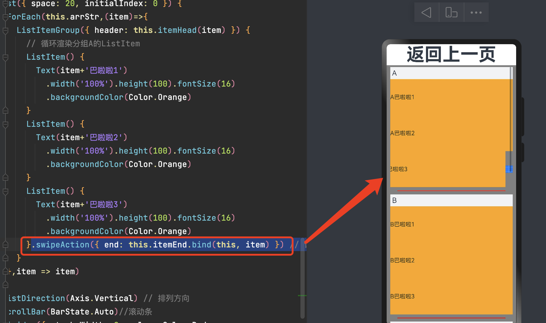
5.4 粘性标题效果(吸顶)
粘性标题不仅有助于阐明列表中数据的表示形式和用途,还可以帮助用户在大量信息中进行数据定位,从而避免用户在标题所在的表的顶部与感兴趣区域之间反复滚动。

      List({ space: 20, initialIndex: 0 }) {
        ForEach(this.arrStr,(item)=>{
          ListItemGroup({ header: this.itemHead(item) }) {
            // 循环渲染分组A的ListItem
            ListItem() {
              Text(item+'巴啦啦1')
                .width('100%').height(100).fontSize(16)
                .backgroundColor(Color.Orange)
            }
            ListItem() {
              Text(item+'巴啦啦2')
                .width('100%').height(100).fontSize(16)
                .backgroundColor(Color.Orange)
            }
            ListItem() {
              Text(item+'巴啦啦3')
                .width('100%').height(100).fontSize(16)
                .backgroundColor(Color.Orange)
            }
          }
        },item => item)
      }
      ......
      .sticky(StickyStyle.Header)  // 设置吸顶,实现粘性标题效果
}
5.5 侧滑
ListItem的swipeAction属性可用于实现列表项的左右滑动功能。侧滑菜单在许多应用中都很常见。
struct ListLayout {
  @Builder itemEnd(index: number) {
    // 侧滑后尾端出现的组件
    Button({ type: ButtonType.Circle }) {
      Image($r('app.media.icon'))
        .width(100)
        .height(20)
    }
    .onClick(() => {
      console.info(index+'被点击')
    })
  }
  build() {
    Column() {
           ListItem() {
              Text(item+'巴啦啦3')
                .width('100%').height(100).fontSize(16)
                .backgroundColor(Color.Orange)
            }.swipeAction({ end: this.itemEnd.bind(this, item) }) // 设置侧滑属性

  }
}
5.6 下拉刷新与上拉加载
页面的下拉刷新与上拉加载功能在移动应用中十分常见,例如,新闻页面的内容刷新和加载。这两种操作的原理都是通过响应用户的触摸事件,在顶部或者底部显示一个刷新或加载视图,完成后再将此视图隐藏。
以下拉刷新为例,其实现主要分成三步:
-
监听手指按下事件,记录其初始位置的值。
-
监听手指按压移动事件,记录并计算当前移动的位置与初始值的差值,大于0表示向下移动,同时设置一个允许移动的最大值。
-
监听手指抬起事件,若此时移动达到最大值,则触发数据加载并显示刷新视图,加载完成后将此视图隐藏。
建议使用PullToRefresh,可以快速上手。
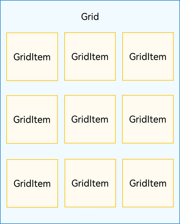
六、网格布局(Grid)
网格布局是由“行”和“列”分割的单元格所组成,具有较强的页面均分能力,子组件占比控制能力,是一种重要自适应布局,其使用场景有九宫格图片展示、日历、计算器等。
ArkUI提供了Grid容器组件和子组件GridItem,用于构建网格布局。Grid用于设置网格布局相关参数,GridItem定义子组件相关特征。Grid组件支持使用条件渲染、循环渲染、懒加载等渲染控制方式生成子组件。
Grid与GridItem组件关系
Grid组件根据行列数量与占比属性的设置,可以分为三种布局情况:
-
行、列数量与占比同时设置:Grid只展示固定行列数的元素,其余元素不展示,且Grid不可滚动。(推荐使用该种布局方式)
-
只设置行、列数量与占比中的一个:元素按照设置的方向进行排布,超出的元素可通过滚动的方式展示。
-
行列数量与占比都不设置:元素在布局方向上排布,其行列数由布局方向、单个网格的宽高等多个属性共同决定。超出行列容纳范围的元素不展示,且Grid不可滚动。
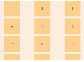
6.1 设置行列数量与占比
通过设置行列数量与尺寸占比可以确定网格布局的整体排列方式。Grid组件提供了rowsTemplate和columnsTemplate属性用于设置网格布局行列数量与尺寸占比。
rowsTemplate和columnsTemplate属性值是一个由多个空格和'数字+fr'间隔拼接的字符串,fr的个数即网格布局的行或列数,fr前面的数值大小,用于计算该行或列在网格布局宽度上的占比,最终决定该行或列的宽度。
-
仅设置rowsTemplate时,Grid主轴为水平方向,交叉轴为垂直方向。
-
仅设置columnsTemplate时,Grid主轴为垂直方向,交叉轴为水平方向。

      Grid() {
        ForEach(this.arr, (day: string) => {
          ForEach(this.arr, (day: string) => {
            GridItem() {
              Text(day.toString())
                .fontSize(16)
                .backgroundColor(0xF9CF93)
                .width('100%')
                .height('100%')
                .textAlign(TextAlign.Center)
            }
          }, day => day)
        }, day => day)
      }
      .columnsTemplate('1fr 1fr 1fr 2fr 1fr')//列数及占比
      .rowsTemplate('1fr 1fr 2fr 1fr 1fr')//行数及占比
      .columnsGap(10)//列间距
      .rowsGap(10)//行间距
      .width('90%')
      .backgroundColor(0xFAEEE0)
      .height(300)
注:当Grid组件设置了rowsTemplate或columnsTemplate时,Grid的layoutDirection、maxCount、minCount、cellLength 属性不生效 。
6.2 设置子组件所占行列数
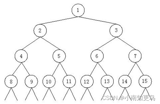
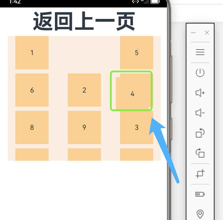
除了大小相同的等比例网格布局,由不同大小的网格组成不均匀分布的网格布局场景在实际应用中十分常见。在Grid组件中,通过设置GridItem的rowStart、rowEnd、columnStart和columnEnd可以实现如图所示的单个网格横跨多行或多列的场景。

rowStart和rowEnd属性表示指定当前元素起始行号和终点行号。如:4 横跨第一行和第二行,只要将将4对应GridItem的的rowStart和rowEnd设为1和2即可。
columnStart和columnEnd属性表示指定当前元素的起始列号和终点列号。如 5 横跨第一列和第二列,只要将 5 对应GridItem的columnStart和columnEnd设为1和2即可。
  build() {
    Column() {
      Grid() {
        ......
        GridItem() {
          Text("4")
            .fontSize(16)
            .backgroundColor(0xF9CF93)
            .width('100%')
            .height('100%')
            .textAlign(TextAlign.Center)
        }
        .rowStart(1)
        .rowEnd(2)
        GridItem() {
          Text("5")
            .fontSize(16)
            .backgroundColor(0xF9CF93)
            .width('100%')
            .height('100%')
            .textAlign(TextAlign.Center)
        }
        .columnStart(1)
        .columnEnd(2)

      }
      .columnsTemplate('1fr 1fr 1fr 1fr')//列数及占比
      .rowsTemplate('1fr 1fr 1fr 1fr')//行数及占比
      ......
    }.height('100%')
  }
6.3 可滚动的网格布局
可滚动的网格布局常用在文件管理、购物或视频列表等页面中。如果仅设置行、列数量与占比中的一个,即仅设置rowsTemplate或仅设置columnsTemplate属性,网格单元按照设置的方向排列,超出Grid显示区域后,Grid拥有可滚动能力。
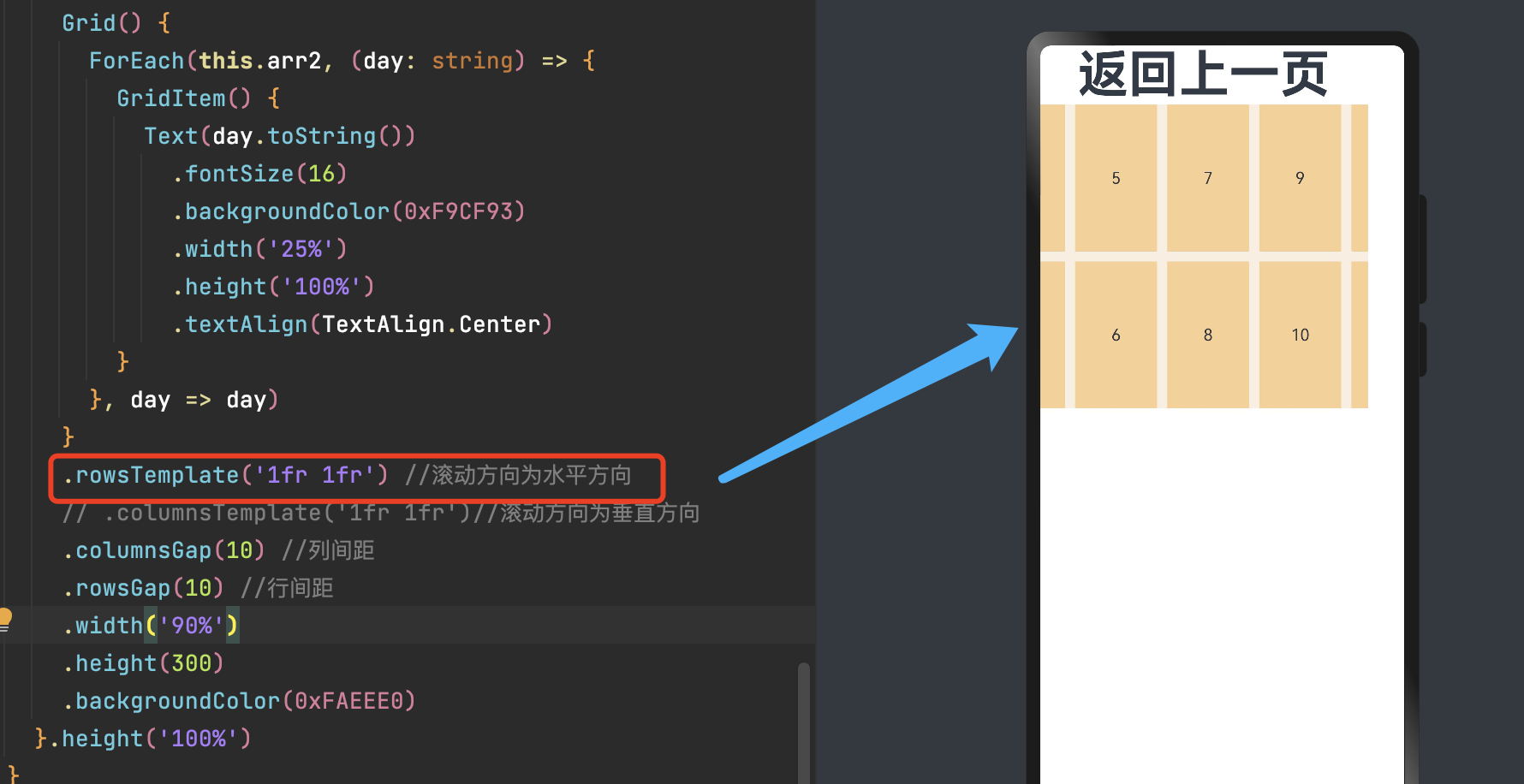
      Grid() {
        ForEach(this.arr2, (day: string) => {
          GridItem() {
            Text(day.toString())
              .fontSize(16)
              .backgroundColor(0xF9CF93)
              .width('25%')
              .height('100%')
              .textAlign(TextAlign.Center)
          }
        }, day => day)
      }
      .rowsTemplate('1fr 1fr') //滚动方向为水平方向
      // .columnsTemplate('1fr 1fr')//滚动方向为垂直方向
      .columnsGap(10) //列间距
      .rowsGap(10) //行间距
      .width('90%')
      .height(300)
      .backgroundColor(0xFAEEE0)
    }.height('100%')
6.4 拖拽
-
设置属性editMode(true)设置Grid是否进入编辑模式,进入编辑模式可以拖拽Grid组件内部GridItem。
-
在onItemDragStart回调中设置拖拽过程中显示的图片。
-
在onItemDrop中获取拖拽起始位置,和拖拽插入位置,在onItemDrop回调中完成交换数组位置逻辑。
注:拖拽动效未达到理想效果( 可拖拽并且交换完成 ,但是拖拽过程中其他组件未联动),自己写了一套不行,直接复制官网代码也没有实现。因为是新手, 这个问题先搁置 。
import router from '@ohos.router'

@Entry
@Component
struct GridLayout {
  @State message: string = '返回上一页'
  @State numbers: string[] = []
  scroller: Scroller = new Scroller()
  @State text: string = 'drag'

  @Builder pixelMapBuilder() { //拖拽过程样式
    Column() {
      Text(this.text)
        .fontSize(16)
        .backgroundColor(0xF9CF93)
        .width(80)
        .height(80)
        .textAlign(TextAlign.Center)
    }
  }

  aboutToAppear() {
    for (let i = 1;i <= 15; i++) {
      this.numbers.push(i + '')
    }
  }

  changeIndex(index1:number, index2:number) { //交换数组中的位置
    const temp = this.numbers[index1];
    if (index1 > index2) {
      this.numbers.splice(index2, 0, temp);
      this.numbers.splice(index1 + 1, 1);
    } else {
      this.numbers.splice(index2 + 1, 0, temp);
      this.numbers.splice(index1, 1);
    }
  }

  build() {
    Column({ space: 5 }) {
      Text(this.message)
        .fontSize(50)
        .fontWeight(FontWeight.Bold)
        .onClick(() => {
          router.back();
        })

      Grid(this.scroller) {
        ForEach(this.numbers, (day: string) => {
          GridItem() {
            Text(day)
              .fontSize(16)
              .backgroundColor(0xF9CF93)
              .width(80)
              .height(80)
              .textAlign(TextAlign.Center)
          }
        })
      }
      .columnsTemplate('1fr 1fr 1fr')
      .columnsGap(10)
      .rowsGap(10)
      .onScrollIndex((first: number) => {
        console.info(first.toString())
      })
      .width('90%')
      .backgroundColor(0xFAEEE0)
      .height(300)
      .editMode(true) //设置Grid是否进入编辑模式,进入编辑模式可以拖拽Grid组件内部GridItem
      .supportAnimation(true) //设置Grid是否开启拖拽补位动画
      .onItemDragStart((event: ItemDragInfo, itemIndex: number) => { //第一次拖拽此事件绑定的组件时,触发回调。
        this.text = this.numbers[itemIndex]
        return this.pixelMapBuilder() //设置拖拽过程中显示的图片。
      })
      .onItemDrop((event: ItemDragInfo, itemIndex: number, insertIndex: number, isSuccess: boolean) => { //绑定此事件的组件可作为拖拽释放目标,当在本组件范围内停止拖拽行为时,触发回调。
        // isSuccess=false时,说明drop的位置在grid外部;insertIndex > length时,说明有新增元素的事件发生
        if (!isSuccess || insertIndex >= this.numbers.length) {
          return
        }
        this.changeIndex(itemIndex, insertIndex)
      })
    }.width('100%').margin({ top: 5 })
  }
}
最终效果应该如下(未实现):
七、轮播(Swiper)
轮播组件通常用于实现广告轮播、图片预览等。
一个简单的轮播图
7.1 基本使用
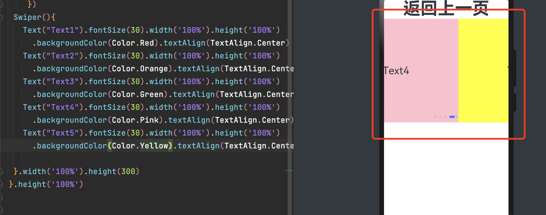
Swiper(){
Text("Text1").fontSize(30).width('100%').height('100%')
.backgroundColor(Color.Red).textAlign(TextAlign.Center)
Text("Text2").fontSize(30).width('100%').height('100%')
.backgroundColor(Color.Orange).textAlign(TextAlign.Center)
Text("Text3").fontSize(30).width('100%').height('100%')
.backgroundColor(Color.Green).textAlign(TextAlign.Center)
Text("Text4").fontSize(30).width('100%').height('100%')
.backgroundColor(Color.Pink).textAlign(TextAlign.Center)
Text("Text5").fontSize(30).width('100%').height('100%')
.backgroundColor(Color.Yellow).textAlign(TextAlign.Center)
}
.autoPlay(true)//自动轮播
.interval(1000)//自动播放时播放的时间间隔 1000毫秒
.width('100%')
.height(300)
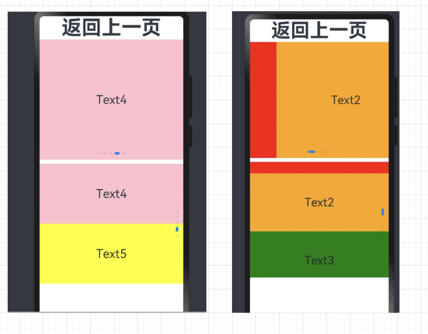
Swiper(){
......同上
}
.autoPlay(true)//自动轮播
.interval(1000)//自动播放时播放的时间间隔 1000毫秒
.displayCount(2)//一页内元素个数
.vertical(true)//是否垂直
.width('100%')
.height(300)
.margin({top:10})
-
loop:是否循环播放。设置为true时表示开启循环,在LazyForEach懒循环加载模式下,加载的组件数量建议大于5个。默认值:true
-
autoPlay:子组件是否自动播放。loop为false时,自动轮播到最后一页时停止轮播。手势切换后不是最后一页时继续播放。默认值:false
-
interval:使用自动播放时播放的时间间隔,单位为毫秒。默认值:3000
-
vertical:是否为纵向滑动。默认值:false
- displayCount:设置一页内元素显示个数。
-
字符串类型仅支持设置为'auto',显示效果同SwiperDisplayMode.AutoLinear。
-
使用number类型时,子组件按照主轴均分Swiper宽度(减去displayCount-1的itemSpace)的方式进行主轴拉伸(收缩)布局。
-
使用number类型且设置小于等于0时,按默认值1显示。
-
7.2 页面切换
-
滑动/自动切换(如上)
- SwiperController(控制器)
-
showNext(): void 翻至下一页。翻页带动效切换过程,时长通过duration指定。
-
showPrevious(): void 翻至上一页。翻页带动效切换过程,时长通过duration指定。
-
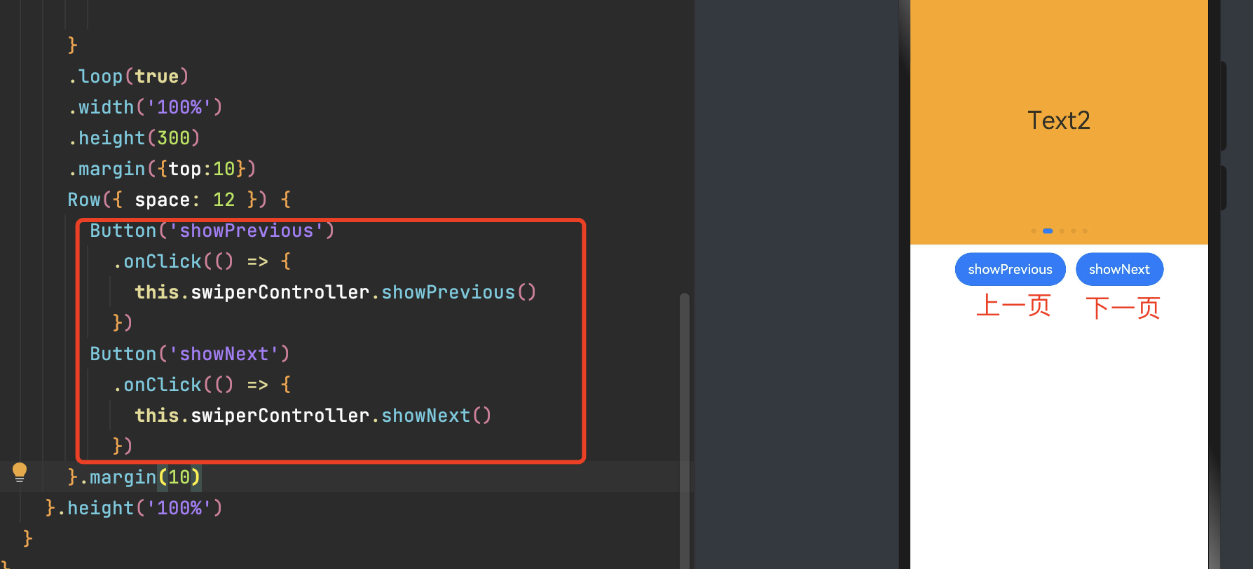
      Swiper(this.swiperController){
        Text("Text1").fontSize(30).width('100%').height('100%')
          .backgroundColor(Color.Red).textAlign(TextAlign.Center)
        Text("Text2").fontSize(30).width('100%').height('100%')
          .backgroundColor(Color.Orange).textAlign(TextAlign.Center)
        Text("Text3").fontSize(30).width('100%').height('100%')
          .backgroundColor(Color.Green).textAlign(TextAlign.Center)
        Text("Text4").fontSize(30).width('100%').height('100%')
          .backgroundColor(Color.Pink).textAlign(TextAlign.Center)
        Text("Text5").fontSize(30).width('100%').height('100%')
          .backgroundColor(Color.Yellow).textAlign(TextAlign.Center)

      }
      .loop(true)
      .width('100%')
      .height(300)
      .margin({top:10})
      Row({ space: 12 }) {
        Button('showPrevious')
          .onClick(() => {
            this.swiperController.showPrevious()
          })
        Button('showNext')
          .onClick(() => {
            this.swiperController.showNext()
          })
      }.margin(10)
除了以上几种常用的布局方式,ArkTS 还提供了许多其他的布局组件和属性,可以根据具体需求进行选择和组合。在实际开发中,建议根据应用的界面设计和用户体验需求来选择合适的布局方式。同时,也可以参考官方文档。
相关推荐
Dev Studio 安装与使用
ArkTS 开发基础/语言
官方文档