仓库链接:https://github.com/MengFanjun020906/HTML_SX
一些今天需要用到的知识点
弹性盒子
<!DOCTYPE html>
<html lang="en">
<head>
<meta charset="UTF-8">
<meta http-equiv="X-UA-Compatible" content="IE=edge">
<meta name="viewport" content="width=device-width, initial-scale=1.0">
<title>Document</title>
<style>
/* 正常情况下 块元素默认是垂直从上向下排列的 */
/* 但是我们有时候需求块元素水平显示 */
/*
把需要水平显示的块元素的父元素设置为弹性盒子
弹性盒子内部的元素是弹性子元素
弹性子元素有自己的排列方式
弹性子元素默认水平排列
主轴:默认水平方向从左向右,左边为起点,右边为重点
弹性子元素默认沿着主轴从起点向重点排列
*/
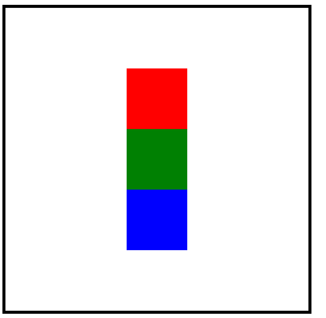
.box {
width: 500px;
height: 500px;
border: 5px solid black;
/* 设置弹性盒子 display: flex; */
display: flex;
/* 设置子元素在主轴的排列方式 justify-content */
/* justify-content设置弹性盒子垂直居中 */
justify-content: center;
/* aligm-items设置水平方向居中 */
align-items: center;
/* 设置主轴的方向 flex-direction */
/* 主轴有四个方向:
row左->右 row-reverse右->左
column上->下 column-reverse下->上 */
/* flex-direction: row; */
/* flex-direction: row-reverse; */
flex-direction: column;
/* flex-direction: column-reverse; */
}
.red {
width: 100px;
height: 100px;
background-color: red;
}
.green {
width: 100px;
height: 100px;
background-color: green;
}
.blue {
width: 100px;
height: 100px;
background-color: blue;
}
</style>
</head>
<body>
<div class="box">
<div class="red"></div>
<div class="green"></div>
<div class="blue"></div>
</div>
</body>
</html>
知识点:
- 弹性子元素有自己的排列方式
- 弹性子元素默认水平排列
- 主轴:默认水平方向从左向右,左边为起点,右边为重点
- 弹性子元素默认沿着主轴从起点向重点排列
- 交叉轴:交叉轴方向跟主轴垂直
- 交叉轴默认方向从上向下,上边为起点,下边为重点
- 不管主轴从左向右还是从右向左交叉轴都是从上向下的
- 不管主轴是从上向下还是从下向上交叉轴都是从左向右的
- 主轴有四个方向交叉轴只有两个方向
边框
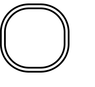
通过更改border-style来改变边框的类型
<!DOCTYPE html>
<html lang="en">
<head>
    <meta charset="UTF-8">
    <meta http-equiv="X-UA-Compatible" content="IE=edge">
    <meta name="viewport" content="width=device-width, initial-scale=1.0">
    <title>Document</title>
<style>
    .i1 {
        width: 100px;
        height: 100px;
        border-width: 10px;
        border-style: solid;
        border-color: black;
        border-style: double;
        border-radius: 50px;
    }
</style>
</head>
<body>
    <div class="i1"></div>
</body>
</html>
盒子模型
<!DOCTYPE html>
<html lang="en">

<head>
  <meta charset="UTF-8">
  <meta http-equiv="X-UA-Compatible" content="IE=edge">
  <meta name="viewport" content="width=device-width, initial-scale=1.0">
  <title>Document</title>
  <style>
    body {
      margin: 0;
    }

    /* 再网页中我们会把html元素想象成一个盒子 */
    /* 盒子可以设置宽高,外边距,内边距 */
    .i1 {
      width: 200px;
      height: 100px;
      border: 5px solid red;
      /* margin-top: 10px; */
      /* margin-bottom: 20px; */
      /* margin-left: 30px; */
      /* margin-right: 40px; */
      /* 当元素的左右外边距设置为auto可以水平居中 */
      margin-left: auto;
      margin-right: auto;
      /* 上 右 下 左 */
      margin: 10px 20px 30px 40px;
      /* 上下  左右 */
      /* margin: 10px 20px; */
      /* margin: 10px auto; */
      /* 上  左右  下 */
      /* margin: 10px 20px 30px; */
      /* 上下左右 */
      margin: 10px;
    }

    /* 内边距会撑大元素 */
    .i2 {
      width: 170px;
      height: 80px;
      border: 5px solid red;
      padding-top: 20px;
      padding-bottom: 10px;
      padding-left: 10px;
      padding-right: 10px;
    }

    /* 普通盒子 */
    /* 宽 = 设置的宽度 + 左右边框 + 左右内边距 */
    /* 高 = 设置的高度 + 上下边框 + 上下内边距 */
    .i3 {
      width: 200px;
      height: 100px;
      border: 5px solid red;
      padding-top: 10px;
      padding-bottom: 10px;
      padding-left: 10px;
      padding-right: 10px;
      /* 边框盒子 */
      /* 宽 = 设置的宽度 */
      /* 高 = 设置的高度 */
      box-sizing: border-box;
    }
  </style>
</head>

<body>
  <div class="i1"></div>
  <div class="i2">这里是内容部分</div>
  <div class="i3">这里是内容部分</div>
</body>

</html>
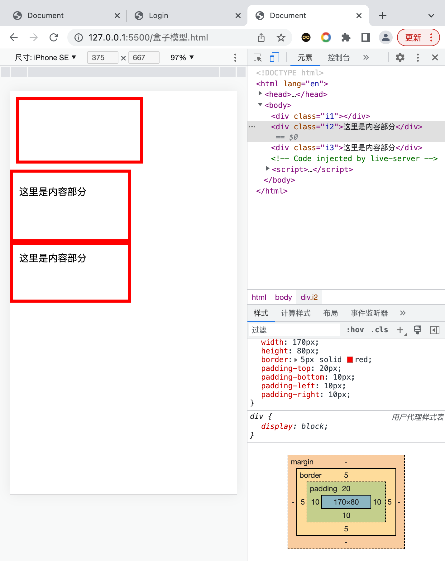
通过检查功能,我们发现i2的长度和高度再观察i3的长度,发现他们在页面是一样长的,但是实际的代码是不一样的,究其原因是因为内部的间距padding给他撑大了。
固定标签
我们在许多网页都见过固定住的导航栏,那我们该如何做这种效果呢
<!DOCTYPE html>
<html lang="en">

<head>
  <meta charset="UTF-8">
  <meta http-equiv="X-UA-Compatible" content="IE=edge">
  <meta name="viewport" content="width=device-width, initial-scale=1.0">
  <title>Document</title>
  <style>
    .i1 {
      width: 100px;
      height: 100px;
      background-color: pink;
      position: fixed;
      left: 100px;
      bottom: 0px;
      /* top: ; */
      /* right: ; */
    }

    /* 当元素没有设置宽度或者高度的时候,元素会被拉伸 */
    .i2 {
      height: 100px;
      background-color: yellow;
      position: fixed;
      left: 10px;
      right: 0;
      top: 10px;
    }

    .i3 {
      width: 100px;
      background-color: green;
      position: fixed;
      top: 0px;
      bottom: 0px;
      left: 200px;
    }
  </style>
</head>

<body>
  <div class="i1"></div>
  <div class="i2"></div>
  <div class="i3"></div>
  123 <br> <br><br><br><br><br>
  123 <br> <br><br><br><br><br>
  123 <br> <br><br><br><br><br>
  123 <br> <br><br><br><br><br>
  123 <br> <br><br><br><br><br>
  123 <br> <br><br><br><br><br>
  123 <br> <br><br><br><br><br>
  123 <br> <br><br><br><br><br>
  123 <br> <br><br><br><br><br>
  123 <br> <br><br><br><br><br>
  123 <br> <br><br><br><br><br>
  123 <br> <br><br><br><br><br>
  123 <br> <br><br><br><br><br>
  123 <br> <br><br><br><br><br>
  123 <br> <br><br><br><br><br>
</body>

</html>
用position: fixed; 写在css中可以让其固定在顶部
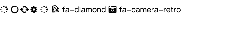
用网上的图标库
从awesomeicon网站下载他们的css,然后把命令写在head中
<link rel="stylesheet" href="path/to/font-awesome/css/font-awesome.min.css">
把这个命令写到body中
<i class="fa fa-camera-retro"></i> fa-camera-retro
图标就出现了
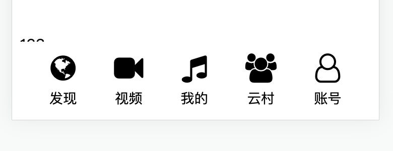
添加底部栏
先写body的内容
 <div class="tab-bar">
        <div class="item">
            <i class="fa fa-globe"></i>
            <span>发现</span>
        </div>
        <div class="item">
            <i class="fa fa-video-camera"></i>
            <span>视频</span>
        </div>
        <div class="item">
            <i class="fa fa-music"></i>
            <span>我的</span>
        </div>
        <div class="item">
            <i class="fa fa-users"></i>
            <span>云村</span>
        </div>
        <div class="item">
            <i class="fa fa-user-o"></i>
            <span>账号</span>
        </div>
    </div>
后面的css更重要
        .tab-bar {
            position: fixed;
            left: 0;
            right: 0;
            bottom: 0;
            background-color: white;
            height: 80px;
            /* border: 1px solid red; */
            display: flex;
            justify-content: space-evenly;
        }
        .tab-bar>.item{
            display: flex;
            flex-direction: column;
            align-items: center;
            justify-content: center;
        }
        .tab-bar>.item>i{
            font-size: 30px;
        }
        .tab-bar>.item>span{
            margin-top: 6px;
            font-size: 14px;
        }
最后的效果就是这样的
添加banner
html
    <div class="banner">

        <img src="img/ad/811.jpg" alt="">
        <div class="pointer">
            <span></span>
            <span></span>
            <span class="active"></span>
            <span></span>
        </div>
    </div>
css
        .banner {
            margin-top: 60px;
            position: relative;
        }

        .banner>img {
            width: 100%;
            border-radius: 6px;

        }

        .banner>.pointer {
            display: flex;
            justify-content: center;
            position: absolute;
            bottom: 12px;
            left:0;
            right: 0;

        }

        .banner>.pointer>span {
            width: 10px;
            height: 10px;
            background-color: gray;
            margin-left: 10px;
            border-radius: 5px;
            margin-right: 4px;
        }
        .banner>.pointer>.active {
      background-color: rgb(0, 153, 255);
    }
但是这里的banner向上移动的时候会盖住搜索栏,他的层叠结构是不太正确的,所以我们设置了z-index
        .search {
            position: fixed;
            display: flex;
            align-items: center;
            justify-content: center;
            left: 0;
            right: 0;
            top: 0;
            padding-top: 10px;
            padding-bottom: 10px;
            background-color: white;
            z-index: 999;
            /* border: 1px solid red; */

        }
        .banner {
            margin-top: 60px;
            position: relative;
            z-index: 2;
        }
添加歌单并且可以滑动
html
<div class="choice">
        <div class="choice-title">
            <span class="left">你的精选歌单</span>
            <button class="right">查看更多</button>
        </div>
        <div class="choice-box">
            <div class="item">
                <img src="img/sheet/100.jpeg" alt="">
                <span>成功人士都在听的歌曲,来看看吧~</span>
            </div>
            <div class="item">
                <img src="img/sheet/10.jpg" alt="">
                <span>暮然回首,那人却在灯火阑珊处</span>
            </div>
            <div class="item">
                <img src="img/sheet/20.jpg" alt="">
                <span>温馨的歌曲,适合在家听</span>
            </div>
            <div class="item">
                <img src="img/sheet/30.jpg" alt="">
                <span>抖音热门歌曲循环</span>
            </div>
            <div class="item">
                <img src="img/sheet/40.jpg" alt="">
                <span>学习/工作/无聊/必备歌曲</span>
            </div>
            <div class="item">
                <img src="img/sheet/50.jpg" alt="">
                <span>乘风破浪会有时,直挂云帆济沧海/span>
            </div>
            <div class="item">
                <img src="img/sheet/60.jpg" alt="">
                <span>赛车爱好者必听歌曲</span>
            </div>
        </div>
    </div>
css
        .choice {

            margin-top: 10px;
        }

        .choice>.choice-title {
            display: flex;
            justify-content: space-between;
            align-items: center;
            margin-bottom: 6px;
            color: #504e4a;

        }

        .choice>.choice-title>.right {
            font-size: 12px;
            color: #999;
            border-radius: 5px;
            border: 1;
            background-color: white;
            border-color: gray;

        }

        .choice-box {
            display: flex;
            /* 设置图像可以滚动显示 */
            overflow: scroll;
        }

        /* 清除滚动条 */
        .choice-box::-webkit-scrollbar {
            display: none;
        }

        .choice-box>.item>span {
            font-size: 12px;
            /* 让文本只显示2行,并且超出的部分显示... */
            overflow: hidden !important;
            text-overflow: ellipsis !important;
            -webkit-line-clamp: 2;
            display: -webkit-box;
            -webkit-box-orient: vertical;
            white-space: normal;
            word-wrap: break-word;
        }

        .choice-box>.item {
            display: flex;
            flex-direction: column;
            width: 80px;
            margin-right: 10px;
        }

        .choice-box>.item>img {
            width: 80px;
            border-radius: 8px;
            margin-bottom: 6px;
        }

        .choice-box>.item>span {
            font-size: 12px;
        }
中间加入可以滑动的功能,并且要去掉滚动条
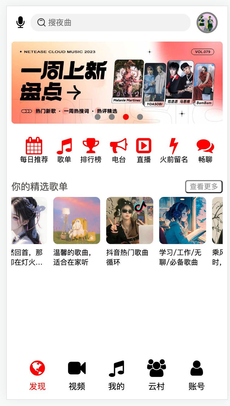
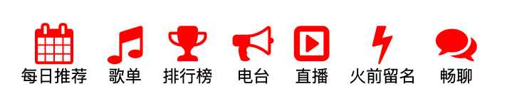
加入其他的功能选项
html
    <div class="category">
        <div class="item">
            <i class="fa fa-calendar"></i>
            <span>每日推荐</span>
        </div>
        <div class="item">
            <i class="fa fa-music"></i>
            <span>歌单</span>
        </div>
        <div class="item">
            <i class="fa fa-trophy"></i>
            <span>排行榜</span>
        </div>
        <div class="item">
            <i class="fa fa-bullhorn"></i>
            <span>电台</span>
        </div>
        <div class="item">
            <i class="fa fa-caret-square-o-right"></i>
            <span>直播</span>
        </div>
        <div class="item">
            <i class="fa fa-bolt"></i>
            <span>火前留名</span>
        </div>
        <div class="item">
            <i class="fa fa-comments"></i>
            <span>畅聊</span>
        </div>
    </div>
css
        .category>.item {
            display: flex;
            flex-direction: column;
            margin-top: 5px;
            margin-bottom: 5px;
            /* border: 1px solid red; */
            align-items: center;
            justify-content: center;
        }

        .category>.item>span {
            font-size: 10px;

        }

        .category>.item>i {
            color: red;
            font-size: 30px;

        }
跟下面的tab-bar效果是一样的